PARKLIFE Festival Branding
THE CHALLENGE
PARKLIFE Festival was established in 2014 and sought to grow significantly in size and recognition in 2015. The 2015 festival moved to a much larger location - Piedmont Park - and booked some top tier talent including Jason Isbell and Chris Stapleton. They needed to develop their brand as the festival made big leaps forward.
OUR SOLUTION
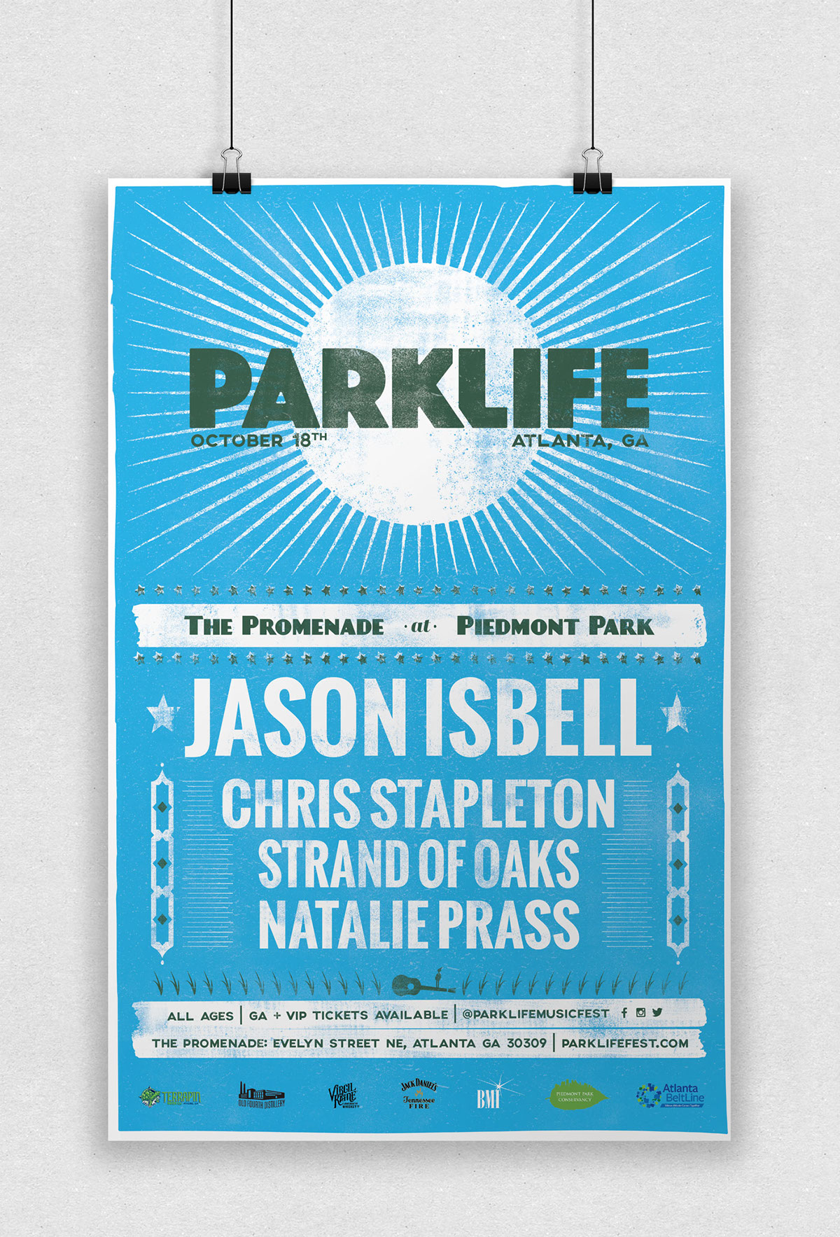
We drew our inspiration from Nashville’s historic Hatch Show Print Shop to create a poster that felt both timeless and modern. We selected a font for the logo that was easy to read at any size but still fun and playful. We ushered in the festival vibes with the huge sun element across the top of the stage.
Website
We built a fully responsive website using elements from the poster. The website featured strong calls to action for purchasing tickets and a hand drawn map to mark the location of the festival.

Logo Redesign
As a primary part of the rebrand we redesigned their logo, making it flexible at all touchpoints, from show posters to social media branding. The landscape layout of the logo made it great for the stage banner and for banner ads and social media header images.


Cheers!

The Results
-All VIP tickets for the festival sold out
-Attendance doubled from previous year